
[Editor’s note: This is part one of a three-part series examining the development of a font touted to help struggling readers.]
Australian researchers, if the data are to be believed, have come up with a way to help people who struggle to understand what they read when they read it and to recall it later. They’ve developed a new font to add what they call “desired difficulty” to a text, boosting immediate comprehension and later recall.
Font design
Historically, font design has been governed as much by the technology available at the time of its creation as it has by design aesthetics. We can see it as we trace language from the 15th century, when Johannes Gutenberg shaped a new method of movable type for his printing press, to the digitized typefaces now available in computer interfaces.
Digital formats allow us to move beyond the physical restrictions of materials when choosing fonts, while at the same time, high-definition digital displays allow the fonts to be straighter, smoother, and more symmetrical than we’ve previously seen.
But research has shown that some of the products are too clean and too smooth to be effective in helping the reader remember information. If information can be read and processed quickly, it can fail to engage our brains in the deeper cognitive processing necessary to effectively comprehend and recall it.[1]
Sans Forgetica font
Enter Sans Forgetica, a font developed in 2018 at Royal Melbourne Institute of Technology (RMIT)’s Behavioural Business Lab under the guidance of Dr. Janneke Blijlevens and Dr. Jo Peryman. It deliberately disrupts the flow of individual letterforms, prompting readers to increase their focus on the text being communicated. Multiple tests undertaken by the researchers have suggested that the result of the disruption/focus is increased comprehension and retention of the text in question.
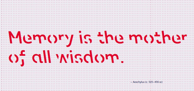
Figure 1: An example of the Sans Forgetica font, using a quote from Aescthylus.
The researchers state, “We believe that Sans Forgetica is just one manifestation of a new way of thinking about design and the psychology of learning – and we’re excited by the potential of what’s to come.”[1]
Unlike conventional fonts, Sans Forgetica’s disrupted form causes readers to stay a moment longer on each word, giving the brain time to engage in deeper cognitive processing, enhancing its ability to interpret what it sees.
The design of the Sans Forgetica font was led by RMIT lecturer of typography and world-renowned typographer himself, Stephen Banham. In collaboration with RMIT’s Behavioural Business Lab, Banham developed several typefaces with varying degrees of ‘distinctiveness’ built in. The typeface that showed the best effect on memory retention was Sans Forgetica.
To learn more about Sans Forgetica and its development, visit RMIT University’s website: www.sansforgetica.rmit.
Next time: Debunking the theory
[1] RMIT. (2018). Sans Forgetica. Retrieved from www.sansforgetica.rmit.
2 thoughts on “Sans Forgetica: Does New Font Boost Reading Comprehension?”